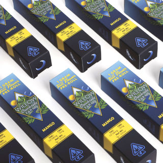
Packaging Design

Album Art
Like with t-shirts, album art makes a statement, but it isn't a personal statement, it's a statement about the music. The creative challenge is finding the right visual language for a non-visual experience.
When I'm designing or illustrating an album, I feast on the music and I get to know the musicians. I started by designing albums for my own music, so I understand the importance of the presentation. It shouldn't be an afterthought, it should be part of the entire concept.

 |
|---|
 |
 |
 |
|---|
 |
 |
 |
 |
I love working with Escaper, the Brooklyn-based space-funk jamband. Their music is all instrumental, so the song titles and album design provide the entire conceptual frame-work. They gave me total freedom to interpret the music, so I let my imagination fly. Inspired by the songs "Hands Up," "Edge Detection" and "Galaxies" I pictured an alien, palmistry diagram. While drawing and listening to the music, that evolved into what you see here.
Tall County, the Hudson Valley acoustic trio, wanted something different for their sophomore album, Featherweight. They wanted an "eye catching" image that would stand out from the other folk and bluegrass CDs on the shelf. I decided to draw a portrait of one of their chickens - the eye staring at the viewer.
 |
|---|
 |
 |
 |
 |
Escaper's first album, Skeleton Key, started with the concept of the key hole. Talking to the band, they wanted something mystical and occult. I decided to do a mandala with symbols representing each song. It's sort of a spell that is unlocked by playing the music.
 |
|---|
 |
 |
 |
|---|
 |
 |
 |
The album design for Frankenpine's the Crooked Mountain was inspired by Pete Seward's series of cell phone tower paintings, Stealth Towers. For the front and back cover, I altered etchings by Verplank Colvin to include cell towers and musicians. For the inside, I illustrated the band and the Williamsburg bridge in a similar style.
So, like the music itself, the album art blended a vintage feel with contemporary content.
For In That Black Sky, Frankenpine's second release, I added a cell tower and the band to one of Pete Seward's oil paintings. We wanted the album to feel more sparse and mysterious, both musically and design.
Posters
Like album covers, gig posters are a visual expression of something ephemeral. The best gig posters don't just convey information, they make a promise: this experince will be something special. They are the beginning of the experience, they set the tone.


T-Shirt Design
A graphic t-shirt isn’t just an item of clothing, it’s a statement of identity. Your shirt isn’t saying what you like, it’s saying who you are, or, at least, who you want to be.
“I’m a geek.” “I’m a bad-ass.” “I want to be at the beach.” “I don’t do my homework."
But trends shift fast in the t-shirt world; the language is always changing and I love spotting the new trends as they happen.
At Changes, I’ve designed thousands of t-shirts over the last 15 years, and every one is for someone specific. That’s what keeps me excited about t-shirts. It isn’t just words and pictures, and it isn’t an ad: It’s people, often kids, who are figuring themselves out and have something to say.
Here are some of my officially licensed Changes shirts, currently available.


Available at Hot topic

available at Walmart

Available at Hot Topic Illustration by Jon Deloca

Available at Spencer Gifts

Available at Spencer Gifts

Available at Bonton

Available at 80stees.com

Available at Hot Topic

Available at Bonton

Available at Belk Illustration by Jon Deloca

Available at 80stees.com

Available at Spencer Gifts


